/
How to Use Traffic Lights in Data Tables
How to Use Traffic Lights in Data Tables
By Jana Volencová (Deactivated)
Nov 21, 2019
If you need to introduce a quick visual evaluation of your data, such as in a Top/Bottom Performers table, you can make use of the traffic lights (green, yellow, red) in the data tables. In the calculation logic, you define the conditions corresponding to each color (see the example below).
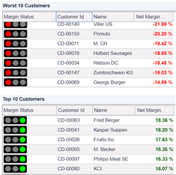
The following images are ready to use:
resultMatrix.libraryImage("Traffic","green")
resultMatrix.libraryImage("Traffic","yellow")
resultMatrix.libraryImage("Traffic","red")
def rawMatrix = api.datamartLookup("CustTX","CustomerName","CustomerID","NetMargin%-")

def resultMatrix = api.newMatrix("Margin Status","Customer Id","Name","Net Margin %")
if(rawMatrix == null) return 0

def i=0
for(entry in rawMatrix.getEntries()) {
  def row =[:]
  row.put("Customer Id",resultMatrix.linkCell(entry.get("CustomerID"),"customersPage",entry.get("CustomerID")))
  row.put("Name",entry.get("CustomerName"))
  def margin = entry.get("NetMargin%")/100
  row.put("Net Margin %",resultMatrix.styledCell(margin,"#006300",null,"bold"))
  if(margin <= 0) row.put("Margin Status",resultMatrix.libraryImage("Traffic","red"))
  if(margin <0.1 && margin > 0) row.put("Margin Status",resultMatrix.libraryImage("Traffic","yellow"))
  if(margin >=0.1 ) row.put("Margin Status",resultMatrix.libraryImage("Traffic","green"))
  resultMatrix.addRow(row)
  i++
  if(i>10) break;
}
resultMatrix.setColumnFormat("Net Margin %",FieldFormatType.PERCENT)
return resultMatrix
Looking for labels? They can now be found in the details panel on the floating action bar.
Related content
How to Create Highchart
How to Create Highchart
More like this
How can I make Price List outputs mandatory?
How can I make Price List outputs mandatory?
Read with this
Icons in Cells
Icons in Cells
More like this
Stacked Column Chart (Using Flex Chart)
Stacked Column Chart (Using Flex Chart)
More like this
Result Matrix
Result Matrix
More like this
Result Matrix
Result Matrix
More like this
Found an issue in documentation? Write to us.