How to Add a Gauge Chart to Line Detail and Header
The Gauge chart is a convenient way to show, for example, how good your quote is compared to the target price. It looks like this:
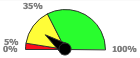
It can be used in Quotes, Price Lists, and many other places. To use it, simply have your calculation logic element return the object ResultGauge returned from calling api.newGauge().
def g = api.newGauge()
g.setMin(0)
g.setMax(100)
g.setValue(20)
g.addSector(5,"#FF0000")
g.addSector(35,"#FFFF00")
g.addSector(null,"#00FF00")

quoteProcessor.addOrUpdateOutput(
  "ROOT",
  ["resultName": "Gauge",
   "resultLabel": "Gaugeeee",
   "resultType": "GAUGE",
   "result" : g ]
)
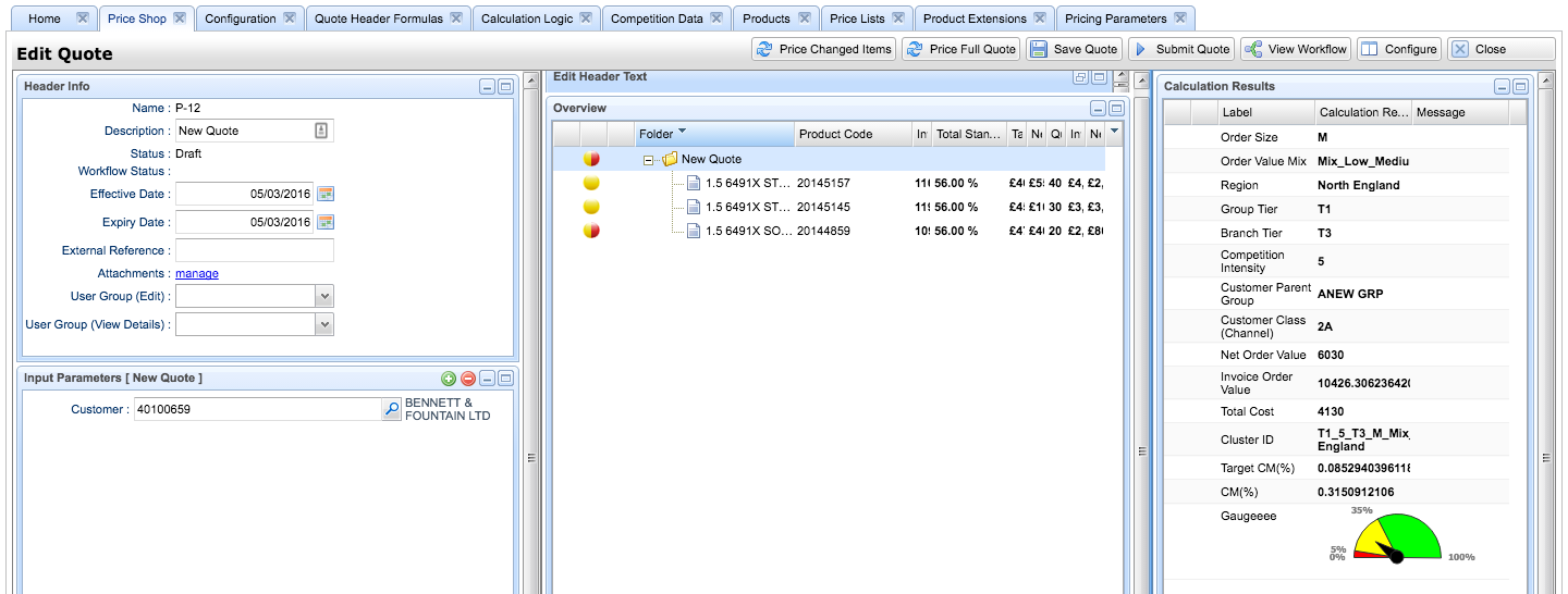
Note: If you add the gauge to Overview as a column, a numerical value will be displayed here, not a graphical gauge as in Calculation Results.
In Unity in Quotes, Contracts, Rebate Agreements and the old Dashboards, default Highcharts styling definition is ignored and not applied to avoid problems with correct chart display. This can result in different look of charts in these three modules compared to other parts of the application (e.g., new Dashboards) which do not ignore this definition. However, if you modify the default Highcharts styling, the definition will be applied which can result in wrong display of the gauge chart in these three modules.
From the version Vesper 6.0 you can use the feature flag 'enableHighchartsThemeInEmber' to control whether the styling definition is applied to charts on Ember pages or not.
Found an issue in documentation? Write to us.